Virtual Worlds / EXPLAINER
The Best Virtual World Has a Good Exit
Immersion becomes useful when people can enter comfortably, act clearly and leave without losing their work.
Begin at the doorway
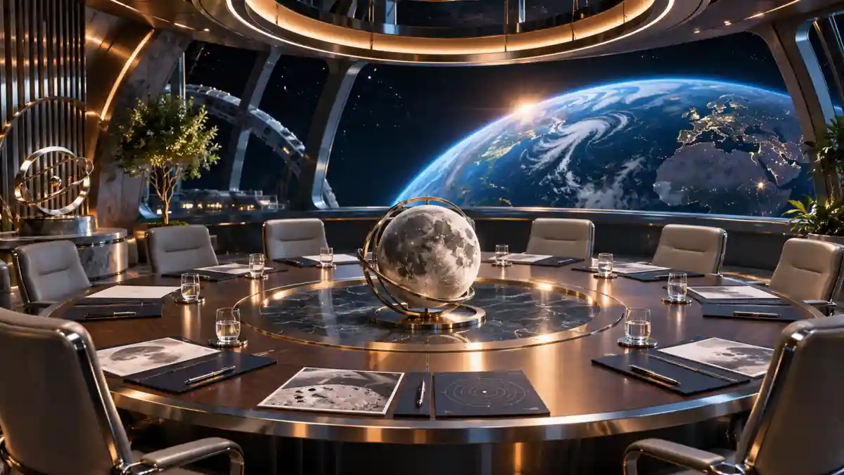
Imagine a virtual museum built around an enormous rotating planet. Visitors can walk through atmospheric layers, inspect terrain and hear explanations from a guide. The scene is impressive. But a visitor who cannot comfortably use the required gestures, cannot hear the narration or cannot locate the exit has encountered a barrier before encountering the subject.
A virtual world is an interface as well as a place. Its quality depends on how people arrive, understand what is possible and regain control when something becomes confusing. The strongest design question is therefore ordinary: what can a person accomplish here, and what stands between that person and the task?
Immersion creates responsibilities
The W3C WebXR Device API describes browser access to virtual and augmented reality devices. Its specification explicitly addresses privacy, security and comfort concerns associated with immersive access. That context is useful even for readers who never write software: an immersive application may interact with information and behavior that a conventional page does not require.
For our hypothetical museum, the first design decision is whether the lesson actually needs every available capability. A planet model can be useful without collecting more information than the experience requires. A permission request should have an understandable purpose at the moment it appears. The visitor should be able to connect the requested access with a benefit they have chosen.
Offer more than one way to act
W3C's XR Accessibility User Requirements document examines the needs of people with different sensory, physical and cognitive abilities in immersive environments. Its broader lesson is that an experience should not assume a single body, input method or way of perceiving information. Accessibility affects the structure of the activity, not just the finishing details.
In the museum example, rotating a planet might work through a controller, an ordinary button or a keyboard command in a companion view. Narration can have readable captions. A location described only as the red doorway can also have a name and a distinct shape. These alternatives let the content remain understandable when a particular movement, sound or visual cue is unavailable.
Choose the smallest useful world
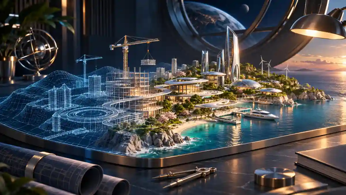
Suppose the museum's lesson is to explain why a planet has seasons. Building a giant walkable city around the exhibit may add atmosphere while making the lesson harder to find. A simpler scene with a controllable orbital model could communicate the concept more directly. The design should earn its spatial complexity through the activity it enables.
A useful prototype might let a visitor change the axial tilt, pause motion and compare two positions. The team can then observe whether people understand the relationship being taught. If visitors spend most of their time learning how to move through the scene, navigation has become the lesson. That is a clear signal to simplify the world before adding more scenery.
Design the exit as carefully as the entrance
Leaving should be an ordinary action. In the proposed museum, a clearly available control returns the visitor to a familiar view, preserves their place and explains what has been saved. A sudden loss of tracking should not strand someone inside a confusing display. The experience needs a clear recovery path when the ideal interaction breaks down.
This also changes how teams think about progress. Completing a virtual lesson should not require remaining immersed longer than a visitor wishes. A saved checkpoint, a readable summary and a conventional way to continue can make the same content useful across different circumstances. Continuity matters more than forcing every moment into the most spectacular presentation mode.
Test usefulness outside the launch trailer
A trailer can show a flawless route through a virtual world. Evaluation should include people taking other routes: missing a cue, choosing an unexpected control, pausing the session or using a different access method. Those moments reveal whether the experience has a coherent structure beneath its appearance. They also expose instructions that only make sense to the team that built it.
The useful measure is what visitors can understand or accomplish with acceptable effort. A world succeeds when its spatial design helps that purpose and its controls keep people comfortable and informed. The doorway, the alternative controls and the exit are part of the creative work. They turn an impressive environment into a place that people can choose to use.
Sources & further reading
Primary sources behind this article. Illustrative scenarios and design judgments are identified in the text.